University Health Network · Service Design · 2022–23

I designed what happens after a transplant patient reports a fever.

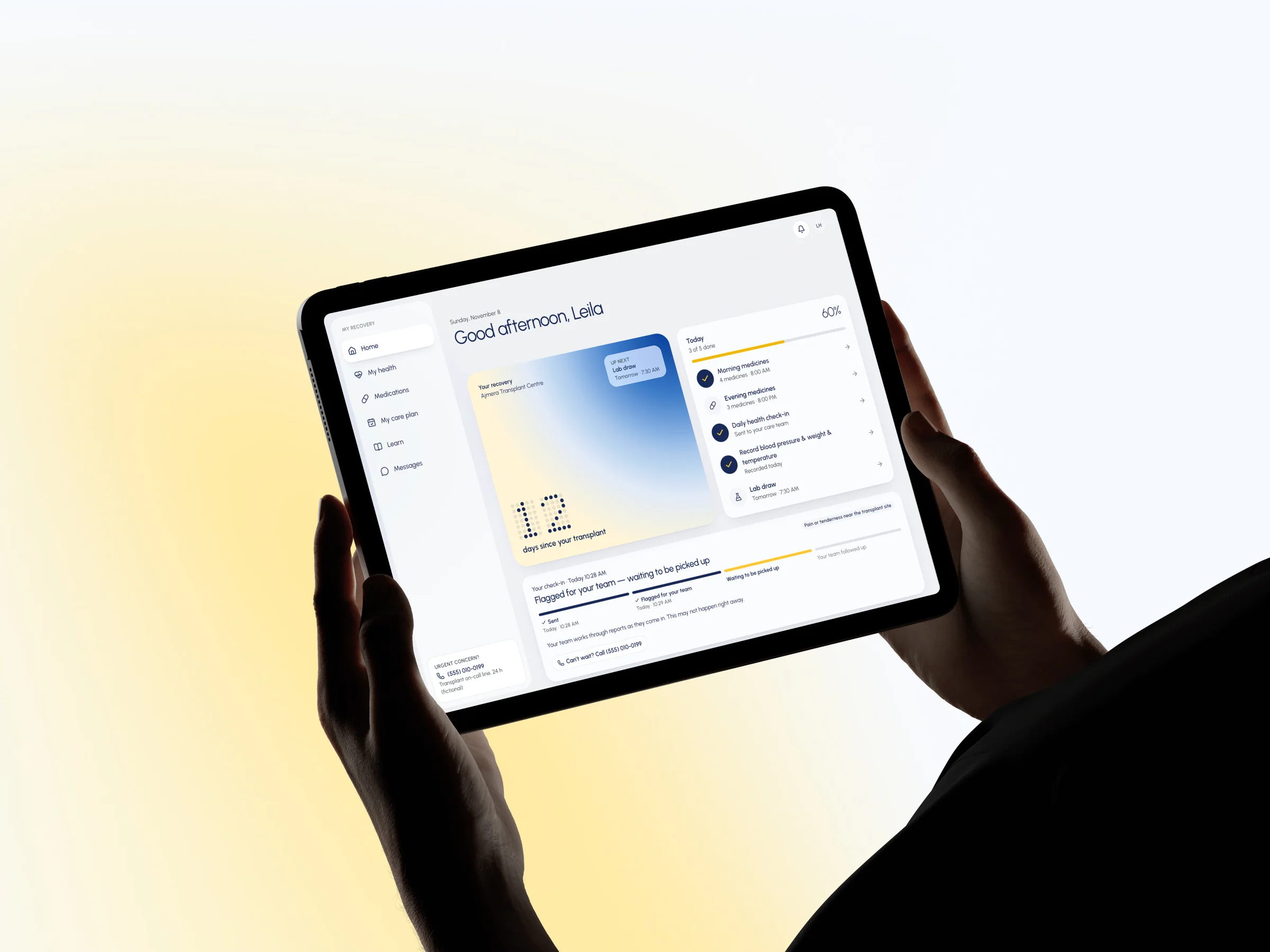
A tablet showing Leila's recovery home: today's checklist, and her symptom report flagged for her care team.

Role

UX Design Specialist

Timeline

Sep 2022 – Apr 2023 · 8 months

Skills

Service Design, Service Blueprinting, Content Design, Prototyping

9:04 PM

20 days after her kidney transplant, Leila feels warm.

Her medicines keep her immune system low, so a fever matters. She could call, leave a voicemail, or send a portal message. Each one went somewhere different, and nothing came back.

So she'd wait. Then call again. Now there are two reports, and no one's name on either.

I spent 8 months at UHN on that gap: what happens after a patient speaks up.

Scattered

Three ways in, three different queues.

Unowned

Whoever picked it up owned it, until they got busy.

Silent

Nothing told her anyone had seen it.

Before: three ways in, no way back
9:04 PM“I feel feverish.”1?1?1?

Solution

I closed the loop between patients and their care team.

The brief said “a transplant portal.” But patients already had myUHN, and a second app would split their attention and duplicate their record.

Patients didn't need another place to check. They needed to know what happens to a report after they press send. So I designed both sides: what the patient does, and what the team does.

Stage 1

Capture

A two-minute daily check-in, using the program's own symptom list.

Stage 2

Route

Rules a nurse can read decide whose list it lands in, and say why.

Stage 3

Resolve

One person owns it, and it can't be closed without a note on what happened.

Stage 4

Return

The patient sees where it is in plain words, then gets the answer.

The Night

I redesigned the same night, minute by minute.

Leila on the left, her care team on the right. Every screen is from the prototype, with synthetic patients.

One night, both sides of the line
9:06 PMLeila, the patient at home
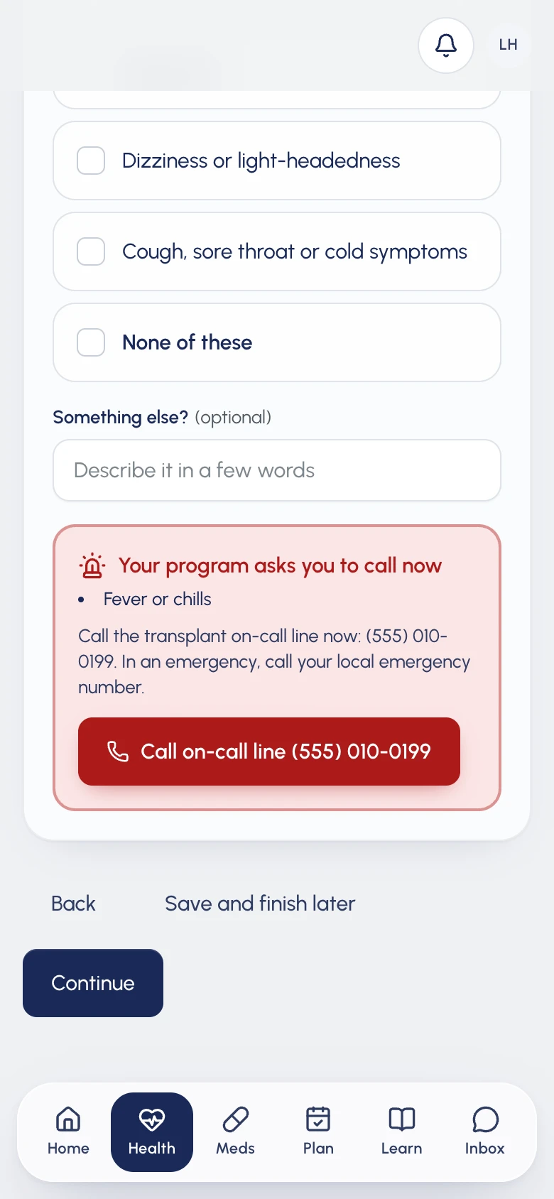
She checks in and ticks “Fever or chills”.

Before she can finish, her program’s instruction appears right there: call the on-call line now. So she does.

Leila's check-in: with Fever or chills ticked, a red panel asks her to call the transplant on-call line now.
9:07 PMCare team at the hospital

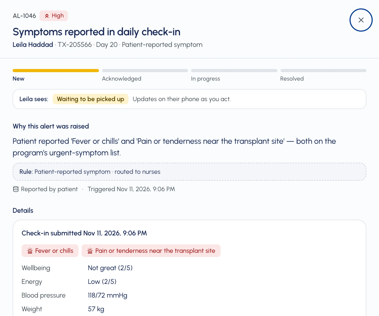
Her report is already in the nurses’ worklist.

With the reason it’s there, in plain English: two symptoms on the program’s urgent list.

The alert panel for Leila's report: why it was raised, the rule behind it, her check-in, and Leila sees: Waiting to be picked up.
9:12 PMLeila, the patient at home

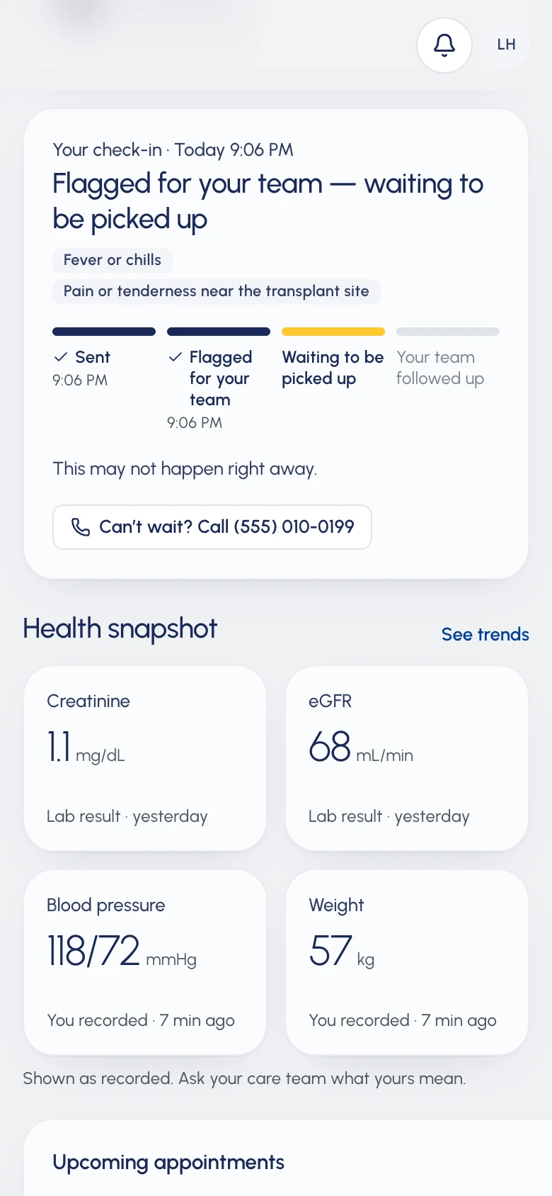
Her phone doesn’t just say “Received”.

It says where her report is, and that it may not be looked at right away. The on-call number stays one tap away.

Leila's home screen: Flagged for your team, waiting to be picked up, with a four-step tracker.
9:31 PM

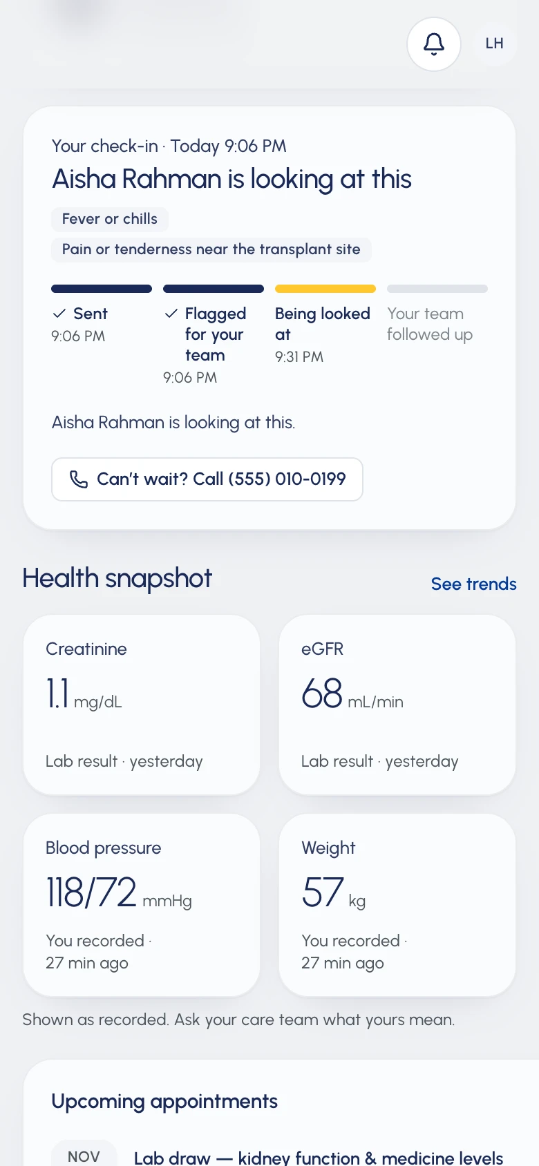
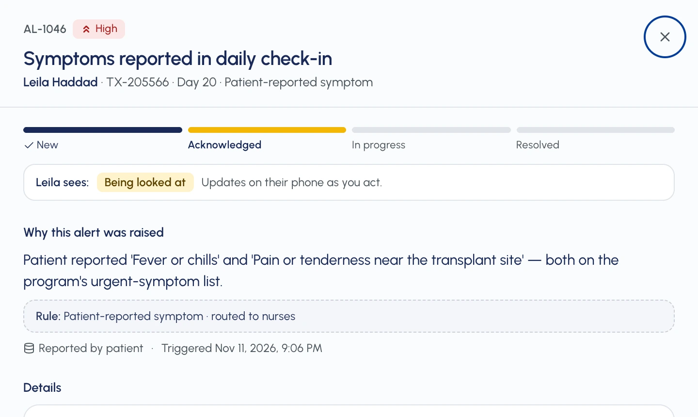
Aisha, a transplant nurse, picks it up. Leila’s phone changes in the same moment.

Acknowledging puts her name on it, and Leila’s tracker moves to “Being looked at”.

Leila's phone: Aisha Rahman is looking at this.
The nurse's panel after acknowledging: Leila sees: Being looked at.
9:48 PMCare team at the hospital

She can’t close it without saying what happened.

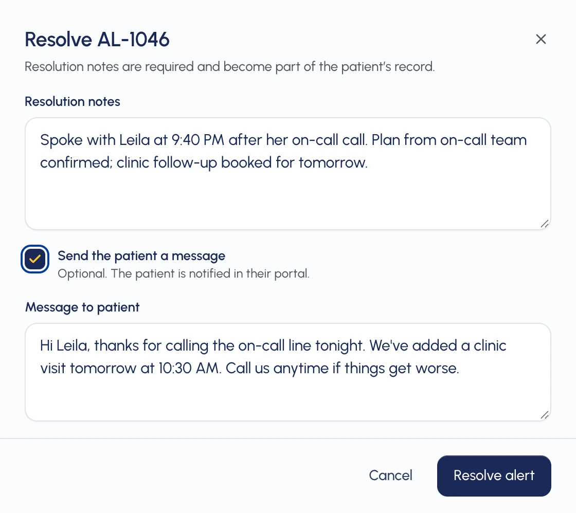
Resolving needs a note for the record, and the reply to Leila is written in the same step.

The resolve dialog: required notes, a ticked box to message the patient, and the reply to Leila.
9:49 PMLeila, the patient at home

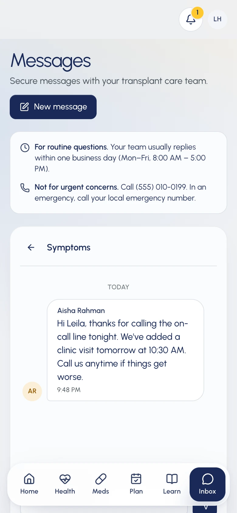
Leila reads it. Loop closed.

43 minutes, and nobody raced. Every step on one side simply showed up on the other.

Leila's messages: Aisha Rahman's reply about tomorrow's clinic visit, sent at 9:48 PM.

Both sides on one page.

Leila only sees the top two rows. The bottom two are the work that keeps them accurate.

Service blueprint: one report, two sides

01 Capture

Patient doesTwo-minute daily check-in
Patient seesCall-now instructions the moment an urgent symptom is ticked
line of visibility
Team does—
Behind itProgram-approved symptom list

02 Route

Patient does—
Patient sees“Sent. May not be reviewed right away.”
line of visibility
Team doesReport lands in the nurses’ worklist, with why
Behind itRules a nurse can read and explain

03 Pick up

Patient doesKeeps going about their day
Patient sees“Being looked at by Aisha”
line of visibility
Team doesAcknowledge = it’s now mine
Behind itOwner + time stamped

04 Resolve

Patient does—
Patient sees—
line of visibility
Team doesAssess, task, resolve with notes
Behind itLinked tasks, audit trail

05 Return

Patient doesReads the reply
Patient sees“Your team followed up”
line of visibility
Team doesOptional reply, written in the same step
Behind itMessage + notification

Return is the part most services skip, and the part this project is about.

Behind the Screens

I said no to three easier versions.

Here's what I picked instead, and why. Two of them you can try.

Decision 1: Show urgent instructions the moment a symptom is ticked

Problem. The warning came last. My first draft put “if this is urgent, call us” on the final screen, like most forms do. Someone with a fever had to finish four steps before learning they should have called.

Ruled out
  • A disclaimer at the end of the form
  • Triage advice generated by the app
Tradeoff
The urgent list belongs to the transplant program, not the app. Slower to change, but clinicians decide what counts as urgent.
Solution: Warn her the moment she ticks a symptom, not after she submits
Version 1

Review and submit

Wellbeing · Not greatSymptoms · Fever, painBlood pressure · 118/72

If this is urgent, please contact the transplant team. Submitting does not guarantee review.

Submit
Final decision · tap to try

Any symptoms today?

Your program asks you to call now

Call on-call line

Decision 2: Translate the team's states instead of exposing them

Problem. Clinical status doesn't help a patient act. “Escalated” or “High priority” scares someone without telling them what to do. But a lone “Received” tick is the same silence I started with.

Ruled out
  • Mirroring the clinical status to patients
  • A single “Received” tick
Tradeoff
Patients see less detail, but enough to know where their report is and when to call instead.
Solution: Show Leila four plain steps, not the team's five states
Leila seesCare team
  1. Sent
    Nothing yet
  2. Flagged for your team
    New
  3. Being looked at
    AcknowledgedIn progressEscalated
  4. Your team followed up
    Resolved

Decision 3: Let the nurse see what the patient sees

Problem. A click nobody sees is easy to put off. If picking up a report is a click only the team sees, it waits behind everything else. Put “Leila sees: Waiting to be picked up” right beside it, and someone is visibly waiting.

Ruled out
  • Response-time targets on every report
  • Keeping status internal
Tradeoff
There are no countdowns or promised times, only an honest status. The team can't break a promise it never made.
Solution: One click updates the nurse's panel and Leila's phone
Clinical portal · nurse

Symptoms reported in check-in

Leila H. · day 20 · fever or chills, pain near site

Status · New

Leila sees: Waiting to be picked up
Patient’s phone

Your check-in · today 9:06 PM

Flagged for your team, waiting to be picked up

  1. Sent
  2. Flagged for your team
  3. Being looked at
  4. Your team followed up
Can’t wait? Call on-call

Evaluation

Did it end with an answer, and did the patient know?

I asked this about every report in the prototype.

It only counted as a yes if all three of these were there.

An owner

One named person picked it up.

A status

The patient could see where it was, in plain words.

An ending

Closing it meant writing down what happened.

Reflection

What I learned

I learned to design the way back.

Collecting reports is the easy half. What patients remember is whether anyone got back to them.

I chose honest over reassuring.

“May not be reviewed right away” felt cold in early drafts. It's also the line that stops someone with a fever from waiting on an app.